

Featured Guest Rina Naik: Color in Home Design: Season 1 Episode 15
Featured guest Rina Naik — interior designer/fine artist/educator — speaks with Katie and Dawn about using color in home design.
Rina Naik is an interior designer, fine artist, and an educator. She’s the owner of Rina Studio, an art and design practice. She holds a B.Sc. and an MFA in Interior Design from Endicott College along with a certificate in drawing and painting from the RISD continuing education program. She is an adjunct faculty and teaches across the curriculum within the accredited Interior Design/Architecture programs at both Endicott College and, previously, at New England School of Design at Suffolk University. She also teaches both art and design courses within the continuing education program at RISD.
As a creative professional rooted in both design and fine arts, she recognizes the close relationship between art, built environments and the human experience. Art and design surround us and infuse richness in our existence. Sometimes they are quiet witness to our lives, yet other times they boldly shape our experience. One of her main interests is color, its applications, understanding its psychology and symbolism and its impact on the human experience. Pretty much everything has a color from a chair, fabric, a teacup. The more we learn about color and how it interacts, the better tools we have to make informed decisions.
Color is part of most art and design courses she teaches. She also created a workshop “Creative color and materials palette for designer” which she offered at Endicott as a special guest event and as a course offering through RISDCE. This workshop can also be offered as a short refresher/ workshop for designers or design offices. Rina teaches color theories and color palettes that are offered through local museums like Attleboro Art museum and Bristol Art Museum.
This love of color informs her fine art practice too. She is an active member at numerous local collaboratives where her work gets shown regularly. She works with designers and architects for site specific commissions for their clients. Her work has been juried in many shows and received awards of merit and excellence and can be found in numerous private collections.
Also, find more about Rina on her Instagram and Facebook feeds.

Rina Naik interior designer/fine artist/educator (photo courtesy of Rina)
Dawn gets the conversation started by sharing some basic definitions that relate to the subject of color in home design:
Color: General term used to describe every hue, tint, tone, and shade that we see
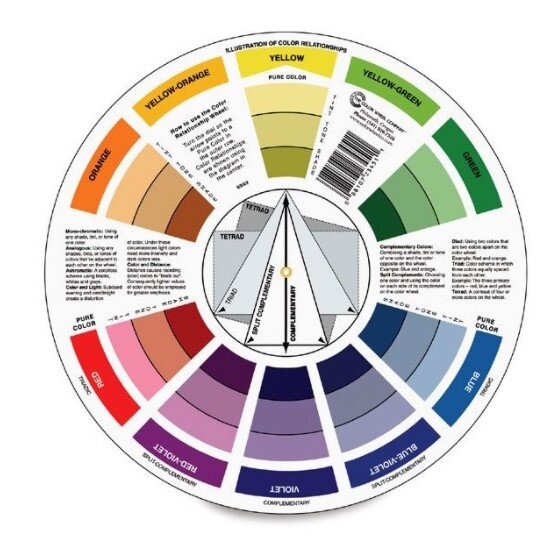
Color Wheel: A circular diagram of the spectrum used to show the ‘relationship’ between colors. *The renowned mathematician Sir Isaac Newton invented the first color wheel in 1666. While studying white light reflecting off prisms, he noticed that the light reflected a spectrum of colors. Newton’s publication of his study of light and color is public domain material. You may read his revelations on color via his book Opticks, found here.
Color Theory: A collection of rules and guidelines about the science and art of using color
Complementary Colors: Opposite pairs of colors on the color wheel, i.e. red and green
Analogous Colors: Colors located beside each other on the color wheel
Monochromatic Colors: Different shades of a color
Primary Colors: Red, Blue, Yellow
Secondary Colors: Mixes of primary colors - Violet, Orange, Green
Tertiary Colors: Mixes of primary and secondary colors
Tint: A color with white added
Tone: A color with grey added
Shade: A pure color with black added
Color Temperature: Refers to the appearance of light provided by a light bulb. Different bulbs emit different color temperatures. ... Based on the Kelvin numbered scale, the higher the color temperature, the cooler, more energizing light will be. A lower color temperature will produce a warmer, more relaxing glow.
*https://www.printmag.com/post/brief-history-color-wheel - Issac Newton

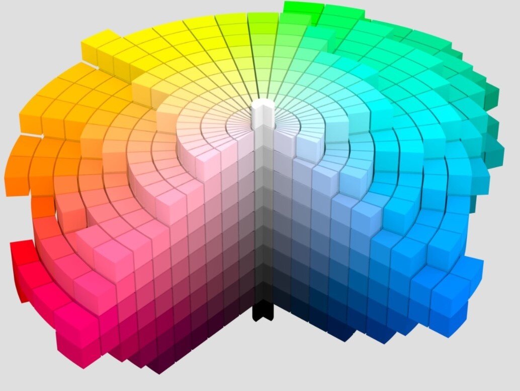
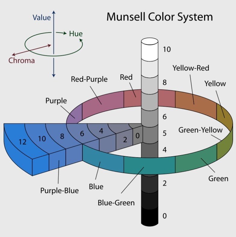
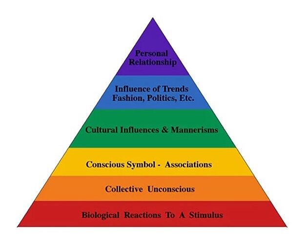
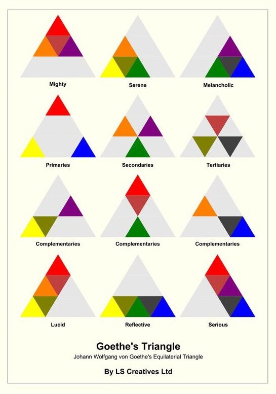
Rina introduces the Color Wheel, Johann Wolfgang von Goethe’s Theory of Colors, Munsell’s Color System, and The Color Experience Pyramid By Frank Mahnke. These systems of color organization can all inform the creation of a color palette for a home design project. Rina describes a few color exercises designers and/or homeowners can consider when selecting color options for a home, taking into account goals, context, balance, daylight, texture, color temperature, and personal taste — among other factors.
Katie, Dawn, and Rina also discuss the various paint companies and the “Color of the Year”.

Katie mentions C2Paint among her go-to paint companies. One of the colors C2 has chosen for their Color Collection 2021 of “nuanced neutrals” is “Paper Clip” (C2-928) .
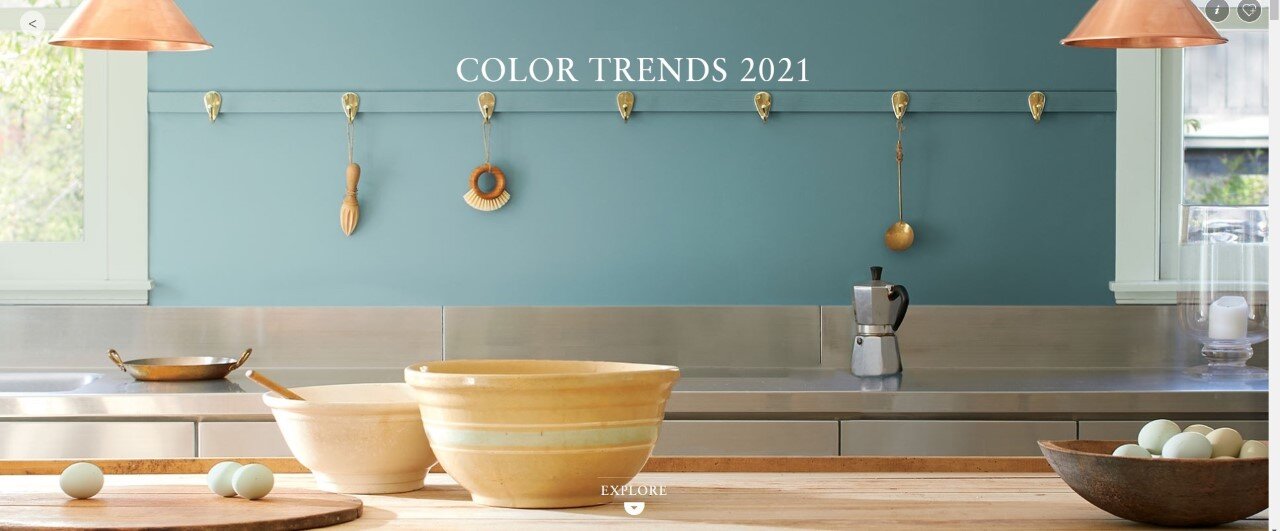
Dawn mentions Benjamin Moore as a reliable resource for her. Benjamin Moore’s Color of the Year “Aegean Teal” (2136-40) sits comfortably among the “sunbaked hues” of their Color Trends 2021.
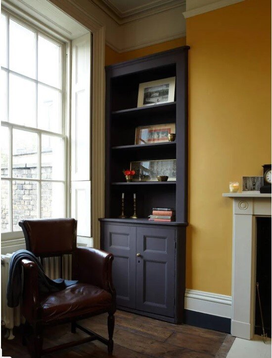
Rina is a fan of Farrow & Ball. F&B see Earthy Tones as 2021 Colour Trends. Among them is “India Yellow (No.66). According to the F&B website, “Its deep ochre shade is strong and moody, but still with an earthy undertone to keep things feeling grounded.”

And then there’s the oft referenced Pantone Colors of the Year 2021: PANTONE 13-0647 Illuminating + PANTONE 17-5104 Ultimate Gray. According to the Pantone website this duo is “a marriage of color conveying a message of strength and hopefulness that is both enduring and uplifting.” (Note how the paint companies mentioned in the other images above bring a nuanced nature-inspired lens to colors like these.)
Books for further reading:
Color, Environment and Human Response by Frank H. Mahnke
A Color Notation (Classic Reprint): An Illustrated System Defining All Colors and Their Relations by Measured Scales of Hue, Value and Chroma Made in Solid Paint for the Accompanying Color Atlas by Albert Henry Munsell
Color by Betty Edwards: A Course in Mastering the Art of Mixing Colors by Betty Edwards
And a website for further reading:
How to Choose Paint Colors from Fine Homebuilding


